Excel Example
Frequency Polygon
Step 1: Enter your frequency table as midpoints in one column and frequency in another.
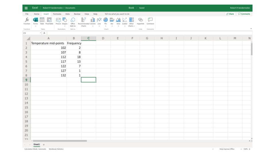
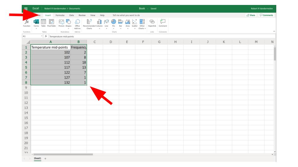
Step 2: Select "insert" in the top menu and highlight your data by clicking and dragging.
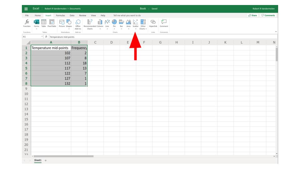
Step 3: Select "scatter" from the top menu
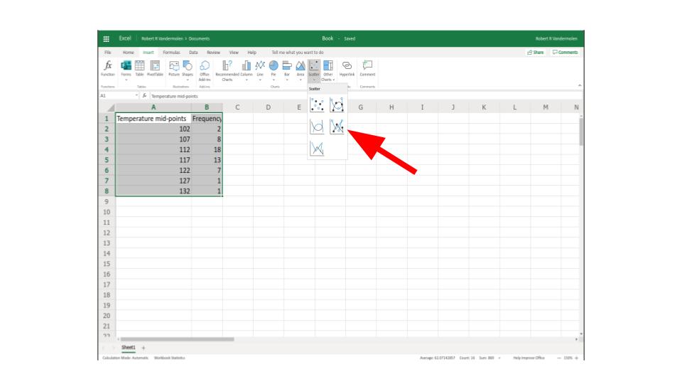
Step 4: Select scatter plot with straight lines
Step 5: right click graph the select "format" for more options
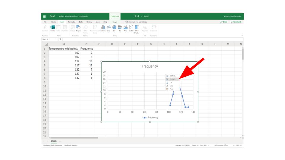
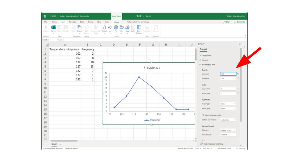
Step 6: You may need to change where the the \(x\) or \(y\) axis starts or begins to make a cleaner picture, you can also change the size and color of the dots etc.
If you want to see this done watch the following video: